
If you’re searching for a clear, practical guide to price action trading basics, you likely want straightforward insights you can apply immediately—without confusing jargon or lagging indicators. This article is designed to give you exactly that.
We’ll break down how price moves, why support and resistance matter, how trends form, and what candlestick behavior reveals about market sentiment. Whether you trade forex, stocks, or indices, understanding raw price movement is the foundation of consistent decision-making.
Many traders struggle because they rely too heavily on indicators that react after the move has already begun. Here, we focus on reading the market in real time—using structure, momentum, and key levels to identify high-probability setups.
Our insights are grounded in continuous market monitoring, technical analysis research, and real-world trading observations across global markets. By the end of this guide, you’ll have a solid framework to interpret charts with clarity and confidence.
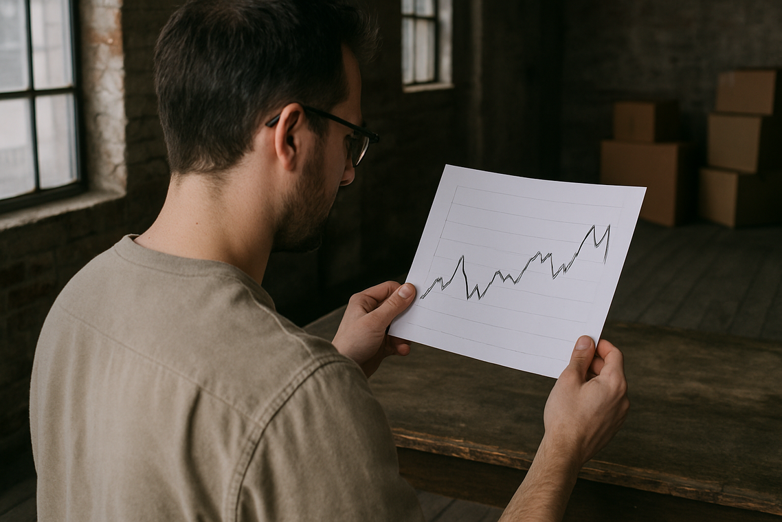
New traders often drown in indicators—RSI, MACD, Bollinger Bands—each flashing conflicting signals. It feels like trying to watch ten movies at once. The simpler alternative is price action: reading raw price movement on a chart. Price is the most direct expression of market psychology, revealing the tug-of-war between buyers and sellers.
Here’s a quick breakdown:
| Term | Simple Meaning |
|---|---|
| Support | Area buyers step in |
| Resistance | Area sellers push back | |
|---|---|---|
| Trend | Direction price consistently moves | |
| Component | What It Shows |
| Body | Net movement between open and close |
| Upper Wick | Rejected higher prices |
| Lower Wick | Rejected lower prices |
If price closes higher than it opened, you get a bullish candle. Buyers won. If it closes lower, it’s bearish. Sellers took control.
Timeframe matters. One daily candle captures the entire day’s battle—every spike, dip, and reversal wrapped into one visual snapshot.
Understanding this is foundational to price action trading basics and connects directly to risk reward ratio explained building discipline into every trade.
Pro tip: Always read candles in context, not isolation.
Mapping the Market Structure: Support, Resistance, and Trends
Before placing any trade, you need to read the room. In markets, that “room” is structure.
Support is a price level where buying pressure has historically overcome selling pressure, acting as a potential floor. Think of it as a trampoline: price falls, hits support, and often bounces. Resistance is the opposite—a price level where selling pressure has historically overcome buying pressure, acting as a potential ceiling. Price rallies, hits resistance, and frequently pulls back.
Some traders argue support and resistance are self-fulfilling prophecies—lines drawn after the fact. They claim markets are too efficient for such simplicity. But if that were entirely true, why do institutional order books often cluster around obvious levels? Even in highly liquid markets, repeated reactions at the same zones suggest crowd psychology is very real (and crowds rarely act randomly).
Using price action trading basics, trends become easier to classify:
- Uptrend: a series of higher highs and higher lows.
- Downtrend: a series of lower highs and lower lows.
- Range/Consolidation: price moving sideways between clear support and resistance.
Identifying the current trend is the MOST critical first step before considering any trade. Buying in a downtrend because price “looks cheap” is like catching a falling knife (it rarely ends well). Countertrend traders may disagree, arguing reversals offer bigger rewards. True—but probabilities favor trading with structure, not against it.
• CAPS
•
•
Map the structure first. Trade second. Always.
Identifying Simple Patterns That Signal Market Turns
Markets leave clues. Candlestick patterns are recurring price formations that reveal shifts in market sentiment—meaning the collective mood of buyers and sellers. When read correctly, they can signal when control is changing hands (and sometimes faster than headlines can keep up).
One of the most reliable reversal signals is the Engulfing Candle. A bullish engulfing pattern forms when a large green candle completely covers the previous red candle, showing buyers have overwhelmed sellers. A bearish engulfing does the opposite. This sudden expansion in range reflects a decisive momentum shift. I recommend waiting for a strong close beyond the prior candle’s body before acting—confirmation reduces false signals.
Another powerful rejection signal is the Pin Bar (often called a Hammer). It features a small body and a long wick, showing price was sharply rejected. A long lower wick signals buyers defended lower levels; a long upper wick shows sellers crushed higher prices.
However, context is everything. These patterns are most actionable at clear support and resistance levels. Using price action trading basics once is smart—but combining them with structure is smarter. Focus on quality setups, not quantity (discipline pays).
Mastering price movement starts with a simple truth: charts tell the story of supply and demand. When buyers overwhelm sellers, price rises; when sellers dominate, it falls. That’s the heartbeat behind candlesticks, market structure like support, resistance, and trends, and the simple patterns that repeat across markets.
You could guess based on headlines, or you could read the chart itself. A versus B: opinion versus evidence.
Now, open any chart and practice spotting these elements using price action trading basics without risking capital. From there, you’ll build the foundation for smarter portfolio optimization and strategic trading. Start today, stay consistent.
Take Control of Your Next Trade
You came here to simplify the noise and truly understand how market movements translate into opportunity. Now you have a clearer grasp of price action trading basics and how reading raw price data can sharpen your timing, improve entries, and reduce costly guesswork.
The reality is that inconsistent results often come from overcomplicating charts and reacting emotionally to volatility. By focusing on clean price structure, momentum shifts, and key levels, you eliminate confusion and trade with intention instead of impulse.
The next step is simple: apply these principles to your charts today. Review recent trades, mark support and resistance zones, and identify where price confirmed—or invalidated—your bias. Then build a structured plan around what the market is actually doing.
If you’re serious about gaining consistency and navigating Asia-focused markets with confidence, access our proven trading insights and real-time market updates trusted by thousands of active traders. Start refining your edge now and turn disciplined analysis into measurable results.
 Ask Gary Pacheconolo how they got into financial pulse and you'll probably get a longer answer than you expected. The short version: Gary started doing it, got genuinely hooked, and at some point realized they had accumulated enough hard-won knowledge that it would be a waste not to share it. So they started writing.
What makes Gary worth reading is that they skips the obvious stuff. Nobody needs another surface-level take on Financial Pulse, Global Investment Insights, Expert Breakdowns. What readers actually want is the nuance — the part that only becomes clear after you've made a few mistakes and figured out why. That's the territory Gary operates in. The writing is direct, occasionally blunt, and always built around what's actually true rather than what sounds good in an article. They has little patience for filler, which means they's pieces tend to be denser with real information than the average post on the same subject.
Gary doesn't write to impress anyone. They writes because they has things to say that they genuinely thinks people should hear. That motivation — basic as it sounds — produces something noticeably different from content written for clicks or word count. Readers pick up on it. The comments on Gary's work tend to reflect that.
Ask Gary Pacheconolo how they got into financial pulse and you'll probably get a longer answer than you expected. The short version: Gary started doing it, got genuinely hooked, and at some point realized they had accumulated enough hard-won knowledge that it would be a waste not to share it. So they started writing.
What makes Gary worth reading is that they skips the obvious stuff. Nobody needs another surface-level take on Financial Pulse, Global Investment Insights, Expert Breakdowns. What readers actually want is the nuance — the part that only becomes clear after you've made a few mistakes and figured out why. That's the territory Gary operates in. The writing is direct, occasionally blunt, and always built around what's actually true rather than what sounds good in an article. They has little patience for filler, which means they's pieces tend to be denser with real information than the average post on the same subject.
Gary doesn't write to impress anyone. They writes because they has things to say that they genuinely thinks people should hear. That motivation — basic as it sounds — produces something noticeably different from content written for clicks or word count. Readers pick up on it. The comments on Gary's work tend to reflect that.